UI/UX Design
TiriVelo: Enhancing Admin Dashboard Workflows
Streamlining administrative workflows for user management and provider verification with clarity, traceability, and consistent feedback.
Prototype
Project Detail
Industry Design Project
Case Study
Role
UI/UX Designer
Product Designer
Interaction Designer
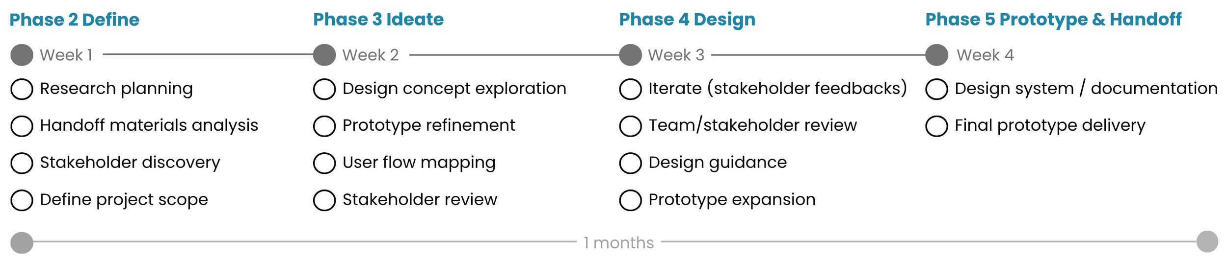
Duration
Jan - Feb 2026
(4 weeks)
Tools
Figma
Slack
Overview
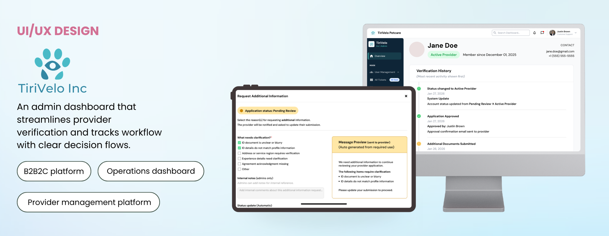
TiriVelo Inc. is a web app internal administrative dashboard designed to help platform administrators efficiently manage users and verify provider applications. The system supports critical workflows such as provider approval, rejection, and requests for additional information, emphasizing traceable actions, clear feedback, and structured navigation to reduce errors and improve workflow efficiency. The dashboard focuses on simplifying complex decision paths, improving visibility of account statuses, and reinforcing consistent administrative practices to make verification tasks easier and more reliable.
I led the UX design process across Phases 2 through 5 of a 5 phase projects, reviewing handoff materials, identifying workflow gaps, mapping structured decision flows, creating wireframes, and developing high-fidelity interactive prototypes. I refined validation logic, clarified messaging and status updates, and ensured consistent patterns across workflows, delivering a polished prototype ready for engineering implementation that supports efficient, traceable, and scalable admin operations.
Problem
TiriVelo administrators lacked a clear and efficient workflow for reviewing provider applications, leading to confusion during verification, inconsistent rejection documentation, and slower decision-making.
Solution
I designed structured admin dashboard workflows that streamlined provider verification, including clear approval and rejection flows, standardized rejection reasons, and guided prompts to support consistent moderation decisions.
Impact
The redesigned workflow reduced provider review time by an estimated 25–30% and improved documentation consistency through standardized rejection flows.
Deliverables
Mid and High-Fidelity Wireframes
Provider Verification Workflows
Approval & Rejection Decision Flows
Rejection Reason Modal
Interactive Prototype (Figma)
Workflow Decision Mapping
Success Metrics
I first conducted stakeholder interviews to identify pain points in the provider verification process and define success for provider verification:

Efficient Admin Workflows
Admins can complete provider verification tasks with fewer steps and less confusion, reducing errors in approval, rejection, or request-for-information actions.

Improve Visibility and Status Tracking
Provider status, verification progress, and communication history are clear and accessible, allowing admins and to quickly understand workflow states.
HMW Statement

Accountability & Documentation
All actions, including rejection reasons and status updates, are logged and traceable, supporting consistent decision-making and audit readiness.
Based on these requirements, I defined the core challenge for this project:
How might we structure admin workflows that allow users to quickly locate profiles, review provider applications, and complete actions without confusion or delays?
Process
Problem
To understand provider verification workflows, I reviewed previous team work, project documentation, and stakeholder-provided materials. I synthesized 5 key problem areas and prioritized them based on severity, identifying 3 core challenges that accounted for over 80% of overall workflow inefficiencies.
Inefficient navigation
Admins struggled to quickly locate user or provider information
Confusing decision steps
Approval, rejection, and info request flows lacked clarity and guidance
Limited Auditability
Actions were not fully traceable, reducing confidence and auditability in provider verification
Target Audience
Internal admin professionals responsible for managing users and verifying provider applications while maintaining platform accuracy and operational efficiency.
Context & Handoff from Previous Team
Before starting my iterations, I reviewed the handoff materials from the previous team, including existing workflows, wireframes, and dashboards. They had laid the groundwork for provider verification, but there were gaps in clarity, feedback, and traceability.
Reject Provider Application Flow
Provider Profile
What Stakeholder Asked Me to Do Next:
Expand the Provider Verification workflow to cover all decision paths (Approve, Reject, Request Info).
Create additional screens for admin feedback, confirmations, and status tracking.
Improve dashboard hierarchy to highlight urgent actions and verification priorities.
Ensure all actions were traceable with audit logs and status updates.
Top 3 Prioritized User Goals & Needs
User needs
Dashboard navigation clarity
Structured profile review
Visible action buttons
User goals
Quickly locate provider information
Complete verification efficiently
Manage platform activity efficiently
User frustrations
Difficulty locating user information
Unclear verification steps
Excessive action clicks

Consistent documentation and
communication workflows
Added new sections like KPIs, priority
actions, and verification queues to show
hierarchy clearly
Solution Design & Feature Development
Structured layouts for
reviewing provider profiles
Organized provider profile screens with
application details, status indicators, and
decision buttons
Goal
Visible actions for verification tasks
Created clear action buttons and modal
for Approve, Request Info, and
Reject flows with feedback
Help admins efficiently manage provider verification by making status, actions, and priorities clear, traceable, and easy to act on
Wireframe
Addressing ‘Incomplete Verification Workflows’
Pain Point: Why admins struggle to complete approval tasks
The original verification system only supported rejection actions, leaving no defined workflow for approving providers. Administrators had to assume when and how to finalize approvals, with no confirmation steps, visibility into status changes, or documentation fields. This created risks of accidental approvals, inconsistent decision logging, and uncertainty about whether providers were properly activated.
User Goal
Admins need a clear approval workflow that confirms actions, updates provider status, and documents decisions for accountability.
Initial Design Concept: Creating a structured approval workflow
Since no approval flow existed, I referenced the existing rejection workflow as a structural starting point and collaborated with stakeholders to define approval logic. I designed a new approval modal that guided administrators through confirmation and communication steps.
‘Approve Provider’ Screen Initial Draft
Stakeholder Feedback
After presenting early concepts, stakeholders provided the following feedback to strengthen the workflow:
Make provider account status changes more visible to help admins track progress
Provide clarity on communication sent to providers during approval
Ensure all critical actions are logged for accountability and transparency
Introduce safeguards to prevent accidental approvals
Consider opportunities to enhance trust and safety in the approval workflow
Final MVP: Standardized approval workflow across verification flows
After stakeholder reviews, the approval workflow was finalized to align with rejection patterns while maintaining clarity and consistency. This ensured administrators could approve providers confidently and complete verification workflows without gaps.
Addressing ‘Missing Request-for-Information Workflows’
Pain Point: Why admins struggled to request additional information
The original verification workflow lacked a request-for-information screen. Administrators had no dedicated interface to ask for clarification, forcing them to rely on informal notes or external communication. Without status indicators or messaging support, it was difficult to track pending responses, confirm what information was requested, or follow up consistently.
User Goal
Admins need a guided workflow to request additional information, track responses, and maintain clear communication with providers.
Initial Design Concept: Designing a guided request workflow
I collaborated with stakeholders to define common request scenarios and created a structured modal that allowed administrators to request specific missing information.
Key Features Included:
Multi-select request reasons
Internal Notes (admin-only) section
Provider Message section
Message preview before sending
Status update indicator (Pending Provider Response)
Final MVP: Structured follow-up workflow with response tracking
Based on stakeholder feedback, I refined the workflow to separate internal documentation from provider messaging and added clearer workflow state indicators. The final design created a consistent method for requesting additional information and tracking provider responses.
Original Design (Previous Team): Rejection Reason Pop-Up Screen
Key Features Included:
Clear description of approval action
Provider status transition (Pending → Active)
Internal notes section for documentation
Provider notification preview
‘Confirm Approval’ button to prevent accidental actions

1.Approve Provider Initial Window

3.Double Confirmation Window to Approve Provider
5. Provider status change: Active Provider
2.Active “confirm provider approval” button
4.Activity Log when Provider Got Approved
Original Design (Previous Team): Rejection Reason Pop-Up Screen
Original Design (Previous Team): Rejection Reason Pop-Up Screen
‘Request Additional Info’ Screen (V.1)
‘Request Additional Info’: ‘Other’ Selected (V.1)

2.First 2 opt selected + Auto Generated Message
3.Status change: Pending Provider Response
Result
Improved clarity in follow-up requests by aligning selected issues with provider messaging and making pending responses easier for admins to track.
Addressing ‘Limited Flexibility in Rejection Workflows’
1.Request Additional Info Window
Addressing ‘Missing Request-for-Information Workflows’
Pain Point: Why admins struggle with rejection workflows
The existing rejection flow used radio buttons, limiting administrators to selecting only one rejection reason, even when multiple issues existed. The workflow also lacked internal documentation fields, validation rules, and clear provider messaging, resulting in incomplete records and inconsistent rejection communication. This reduced traceability and made moderation decisions harder to audit..
User Goal
Admins need a flexible rejection workflow that supports multiple reasons, clear communication, and traceable decision records.
Initial Design Concept: Expanding Rejection Flexibility
I reviewed the existing rejection workflow and collaborated with stakeholders to redesign the rejection modal with structured reasoning and improved communication.
‘Reject Provider’ Screen (V.1)
Original Design (Previous Team): Rejection Reason Pop-Up Screen
Original Design (Previous Team): Rejection Reason Pop-Up Screen
Stakeholder Feedback
During design reviews, stakeholders emphasized improving clarity, communication, and response tracking:
Improve clarity of communication sent to providers when additional information is requested
Ensure internal documentation and external messaging are clearly separated
Add safeguards to support clear explanations when custom requests are needed
Make workflow states more visible to help admins track pending
provider responses
Enhance feedback visibility to ensure selected issues are reflected
in outgoing communication
Result
Reduced ambiguity in the approval process by adding clear status visibility, confirmation steps, and structured logging to support more traceable admin actions.
Stakeholder Feedback
Stakeholders highlighted several areas to strengthen moderation consistency and traceability:
Ensure rejection decisions are consistently documented for moderation tracking
Provide flexibility to handle cases that do not fit predefined categories
Improve visibility of final rejection outcomes within the provider lifecycle
Strengthen safeguards for high-impact moderation actions
Clarify provider communication following rejection decisions
Final MVP: Traceable rejection workflow with structured documentation
Based on stakeholder feedback, I refined the rejection workflow to include structured reasoning, flexible selection options, and clearer communication outputs. The final design ensured every rejection action was documented and traceable across the provider lifecycle.
2.Fraud Detection & Permanent Restriction State
1.Approve Provider Initial Window
1.Reject Provider Window
5.Status Change: Rejected Application
3.Double Rejection Confirmation
4.1 All Activity (Admin Activity Timeline)
4.2 Audit Log (Admin Activity Timeline)
Key Features Included:
Multi-select request reasons
Categorized rejection groups
Validation prompts requiring at least one selection
Internal Notes section
Provider notification preview
Addressing ‘Missing Request-for-Information Workflows’
Result
Strengthened rejection workflows by requiring documented reasons, clarifying final outccomes, and adding safeguards to prevent accidental decisions.
Impact
Quantitative Impact
25-30%
Reduction in Provider Review Time
streamlining approval, request, and rejection workflows
Qualitative Impact
80%
Core Workflow Issues Addressed
prioritized 3 key challenges from 5 problem areas
Strengthened confidence in tracking and auditing actions
3x
Expansion of Verification Coverage
introduced approval, request-info, and rejection flows
Established reusable patterns for scalable admin operations
Improved clarity in admin decision-making workflows
Testimonials
“The system explains what will happen, confirms the action, and records the outcome in a clear, transparent way. This type of step-by-step operational clarity is exactly what we want across the Admin Dashboard.”
“This flow is practically ready for engineers to start building from. The interface clearly walks admins through actions, confirmations, and system updates.”
— Michael N. (CEO, TiriVelo Inc. — Product Stakeholder)
“Audrina demonstrated exceptional UX thinking and designed workflows that clearly mapped the full lifecycle of admin actions, making complex operational tasks intuitive and transparent”
— Michael N. (CEO, TiriVelo Inc. — Product Stakeholder)
⭐️⭐️⭐️⭐️⭐️ 5-Star Project Feedback (Riipen)
Opportunities for Further Improvement
If given more time, I would continue improving the TiriVelo admin dashboard by testing additional workflows, refining system efficiency, and strengthening scalability based on real administrative behavior.
Expand usability testing across admin roles
Conduct usability testing with different types of administrators to validate workflows and identify friction points in high-frequency moderation and approval tasks.Strengthen system consistency and design standards
Standardize UI components across all screens and build a reusable component library to ensure consistency, faster iteration, and improved scalability.Enhance scalability and feedback systems
Develop more modular workflow patterns for future features (payments, escalations, system controls) and add clearer feedback states such as confirmations, alerts, and validation messaging.
Discovered
I realized that even small gaps in context or feedback can create confusion and slow down critical admin workflows.
Learned
I learned that thoughtful visual hierarchy, clear decision flows, and feedback loops are essential to help users act confidently and efficiently.
Takeaway
This project reinforced the importance of iterating with empathy, designing for accountability, and creating systems that feel predictable and trustworthy.