UI/UX Design
Blūm: Designing a Habit-Driven System to Reduce Food Waste
Helping young adults maintain an accurate pantry and build consistent food habits through visibility, automation, and habit reinforcement.

Prototype
Project Detail
Solo Capstone Project
Case Study
Role
Product Designer
Mobile Designer
UX Researcher
Duration
Nov 2025 - Jan 2026
(12 weeks)
Tools
Figma
Miro
Adobe Illustrator
Overview
Blūm is a mobile application that helps young adults reduce food waste, save money, and make healthier eating choices by simplifying pantry management through receipt uploads, manual item entry, meal logging, and visual progress tracking. The app focuses on reducing friction, increasing visibility, and reinforcing consistent habits to make sustainable behavior easier to maintain.
I led the end-to-end UX design process across Phases 1 through 5, conducting research, defining pain points, mapping user flows, creating wireframes, and developing interactive prototypes. I applied usability feedback to optimize grocery logging and progress tracking, and delivered high-fidelity designs ready for development.
Problem
Young adults want to eat healthier, save money, and reduce food waste, but busy schedules and mental overload make consistency difficult.
Solution
I designed Blūm as a pantry-first mobile system that simplifies grocery tracking and meal logging, increases visibility of expiring items, and reinforces consistent, sustainable habits through small, repeatable actions.
Impact
Reduced pantry logging time by 42%
Improved engagement and task completion success by 80% of test users
Increased confidence in pantry awareness by 48%
Deliverables
Conducted user research, defined pain points around pantry tracking, meal logging, and food waste habits, and created personas to guide design decisions.
Designed user flows, wireframes, and prototypes for grocery uploads, manual item entry, meal logging, and visual progress tracking.
Conducted usability testing, iterated on input friction, logging discoverability, and rewards visibility, and delivered high-fidelity designs ready for development.
Success Metrics
Users should be able to:
Log a grocery item in under 15 seconds
Identify expiring items at a glance
See how daily actions contribute to rewards and progress
Core Product Focus🌟
The primary user behavior is to maintain an accurate pantry inventory with minimal effort.
The overall goal is to design a mobile application that helps young adults maintain an accurate pantry inventory with minimal effort while making food tracking fast, visible, and motivating.
Core Behavior Loop

Upload Groceries


Pantry Updates

Streak Builds
Log Meals

Inventory Updates
Small, repeatable actions reinforce habits
Progress is visible and motivating, creating business value by improving engagement
Why This Matters
This loop ensures:
This loop ensures:
Users always know what they own
Inventory stays accurate
Process
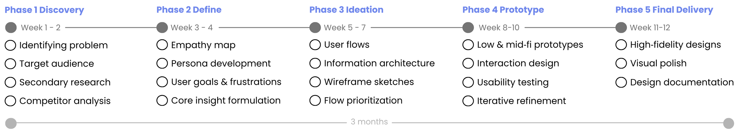
Phase 1 Discovery
I conducted research to understand why young adults struggle with food waste and inconsistent pantry tracking. This included reviewing existing tools, analyzing user behavior, and uncovering barriers to healthy, sustainable habits.
Identifying the Problem
Context
Food waste is a growing global issue, yet many households still struggle to manage food effectively. I wanted to explore how digital tools could help young adults reduce everyday food waste through small behavioral changes.
Initial Exploration
To better understand the problem space, I conducted
This early exploration helped reveal how people currently track food at home and where existing solutions fall short.
Problem
Young adults want to eat healthier, save money, and reduce food waste, but busy schedules and mental overload make it hard to stay consistent. Key challenges include:

Forgetfulness
Users often forget what’s in their pantry, leading to over-purchasing or wasted food

Lack of planning
Grocery organization feel overwhelming without a simple system
HMW Statement
Routine disruption
Busy lifestyles and changing schedules break healthy habits, reducing consistency
How might we help young adults stay aware of what’s in their pantry and make meal choices that reduce waste?
Target Audience
Young adults (18–30) who are budget-conscious, health-aware, and want to reduce food waste but struggle with planning and consistency.

Mindful Maddy

Practical Ben
Secondary Research

77%
77% of Americans waste food simply because items are forgotten or lost in cluttered refrigerators, showing that poor visibility is a key factor driving household food waste
(Bosch Home Appliances / OnePoll, 2019)
Core Insight

133 billion pounds
Food wasted per year
30–40% of the U.S. food supply is wasted, equating to roughly 133 billion pounds of food each year. That represents 1,249 calories per person, per day.
(Bosch Home Appliances / OnePoll, 2019)
Young adults (ages 18–34) report some of the highest rates of food waste, 71% more food than older generations, often due to overbuying, lack of planning, and forgetting items in refrigerators or pantries.
(Natural Resources Defense Council)
Food waste is a visibility and planning systems problem, not an awareness issue, particularly among young adults who lack structured support for managing groceries.
Competitor Analysis
By analyzing existing food waste, pantry tracking, and meal planning apps, I identified key patterns in how current solutions attempt to reduce food waste and where they fall short for young, busy adults.

BitePal
AI pantry & food tracking
Key Analysis
Too Good To Go
Surplus food marketplace
Duolingo
Gamified habit-building platform
Tracking Over Behavior
Most food waste apps focus on logging and expiration tracking, but rely heavily on manual input.
Weak Motivation Systems
Food waste apps focus on organization, but unlike Duolingo, which uses streaks, progress tracking, and rewards to drive consistent habits, they lack strong motivation systems to sustain user behavior.
Not Integrated Into Daily Routines
Current solutions feel like separate tools rather than part of grocery planning and everyday life.
Phase 2 Define
I synthesized research insights to define core pain points, target audience needs, and design opportunities. I created personas and clarified user goals to guide the design direction.
Empathy Map
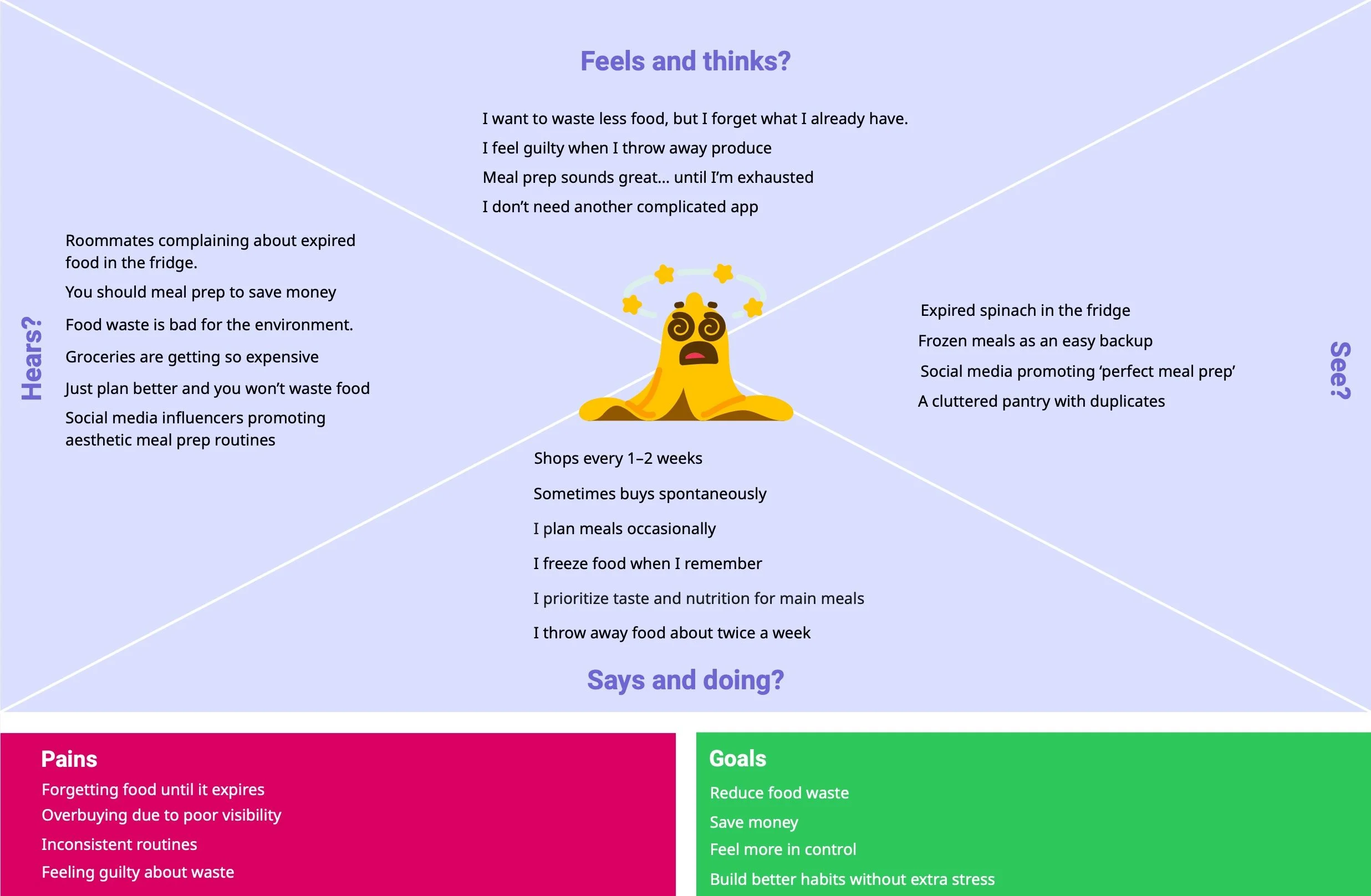

This user is motivated to reduce food waste, save money, and build healthier habits, but struggles with consistency due to busy schedules, shifting routines, and cognitive overload. Food waste happens when pantry visibility is low, and planning feels overwhelming.
The gap between intention and action stems from a lack of a simple, lightweight system that supports everyday decision-making without adding complexity.
This opens an opportunity for Blūm to directly address this user’s needs by increasing pantry visibility, reducing cognitive load, and reinforcing small, consistent actions, transforming good intentions into sustainable daily habits without adding complexity.
Persona
Mindful Maddy
Maddy needs to know what’s in her pantry before shopping so she doesn’t overbuy
Practical Ben
Ben wants to maintain an accurate pantry with minimal effort so he can reduce food waste and avoid frantic grocery runs.
In developing Maddy and Ben, I realized the problem wasn’t grocery knowledge or motivation, but it was behavioral sustainability. Both personas demonstrated that habit breakdown happens during routine disruption, not during moments of intention. This led me to design Blūm as a flexible system rather than a rigid planner. Instead of enforcing strict meal prep structures, I focused on micro-interactions, low-commitment logging, and positive reinforcement to support imperfect routines. Their behaviors influenced my decision to prioritize adaptability, emotional reinforcement, and lightweight daily engagement over feature-heavy tracking.
Core Insight
Young adults do not waste food because they lack awareness or care; they waste food because their routines are inconsistent, and without a lightweight system to maintain visibility and reinforcement, good intentions collapse under cognitive load.
Top 3 Prioritized User Goals & Needs
User needs
Clear visibility of what’s expiring
Simple, low-effort tools
Motivation to stay consistent
User goals
Reduce food waste
Maximize groceries pantry
Build better planning habits
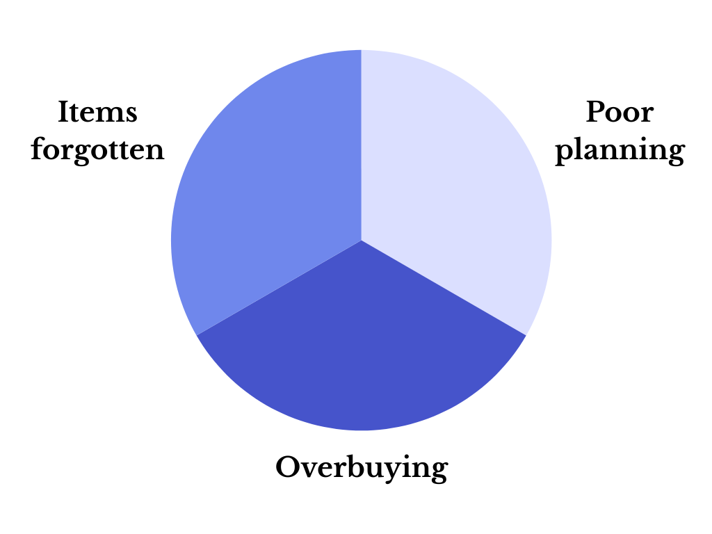
User frustrations
Forgetting food until it expires
Overbuying due to poor planning
Feeling guilty about wasting food
See what food is expiring soon
Pantry Inventory highlights
near expiration items
Solution Design & Feature Development
Stay motivated to reduce waste
Meal logging with streaks and rewards
Goal
Save time entering groceries
Receipt upload to auto-add items
Help young adults reduce food waste, save money, and make healthier choices by providing simple, actionable tools that fit seamlessly into their busy daily routines
Strategic Opportunities
Phase 3 Ideation
I explored design solutions through sketches, low-fidelity wireframes, and information architecture. I mapped key user flows to simplify pantry tracking and reinforce repeatable, low-friction habits.
Design Principles
Blūm focuses on three key principles:

Reduce Friction
Pantry updates should be fast and effortless

Increase visibility
Expiring items are clearly surfaced

Reinforce Progress
Reward consistent behavior
Informational Architecture
45 screens
Before designing screens, I structured how users would interact with the app to ensure clarity and ease of use. A clear information architecture and flow helps prevent confusion, reduces cognitive load, and supports the primary user behavior of maintaining pantry awareness with minimal effort.
Primary Sections
Pantry – Central hub for inventory visibility
Add Items – Quick entry point for grocery logging
Meal Log – Connects usage to inventory updates
Progress – Shows rewards and consistency over time
Recipes – Inspires use of existing pantry items
UX Rationale
This structure reduces decision fatigue by prioritizing the most frequently used functions (Pantry & Add Items) and supports sustained engagement by making feedback and progress visible.
User Flow
Uploading Groceries
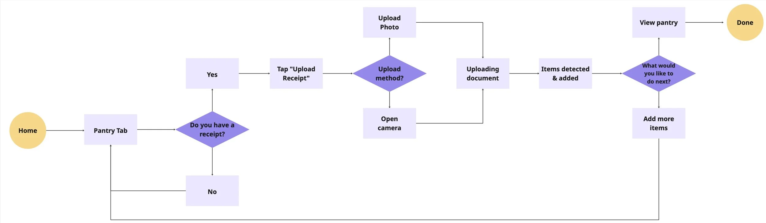
Flow 1: Upload a Receipt
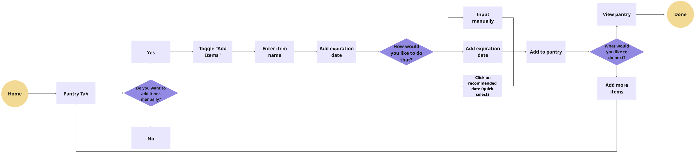
Flow 2: Adding Items Manually
Why
Users need a simple way to keep their pantry up to date and reduce food waste
What I Did
Designed a flow with two options: upload a recipe or add items manually. For manual entry, users can type the item name and set an expiration date via calendar or manual input, or select from recommended suggestions. Users can review their pantry inventory at the end to confirm all items are tracked
Results
Offering multiple input options and a final review reduces friction, making it easier for users to maintain an accurate pantry and build consistent, sustainable habits
Ideation and Iteration
37 screens
Onboarding Flow
Reduce Waste Flow
Home Walkthrough
Grocery Shopping Flow
Process
Exploring multiple flows
I began by ideating multiple user flows, including onboarding, home navigation, grocery tracking, and food waste reduction, to understand how users might interact with the app across different moments. Each flow was designed around three core user goals: reduce food waste, maximize groceries in their pantry, and build better planning habits.
Connecting User Goals to Flows
Each flow was mapped to support these goals:
Grocery tracking helps users maximize their pantry by keeping inventory visible and up to date
Home navigation provides quick access to key actions, supporting better planning habits
Reduce-waste flow prompts timely actions, helping users reduce food waste before items expire
This ensured that every feature and step within the flows directly supported a meaningful user need.
Iterating Through Feedback
Through mentor feedback and multiple iterations, I narrowed my focus to the reduce-waste flow, as it aligned most strongly with user goals and stood out as the most compelling experience during my presentation. I prioritize experiences that felt intuitive, actionable, and easy to integrate into daily routines.
Focused Direction
Based on this iterative process, I narrowed my focus to the reduce-waste flow, as it most strongly aligned with all three user goals. This flow creates the most impact by guiding users to take small, timely actions, helping them reduce food waste, make better use of their groceries, and build consistent planning habits.
Wireframe
Addressing ‘Maintaining an Accurate Pantry Inventory’
Add Item Flow
Pain Point: Users often forget what items they already have at home, making it difficult to keep track of groceries and maintain an accurate pantry.
User Goal
Add grocery items quickly so their inventory stays current and reliable.
Design Decision
Manual item entry allowed users to add groceries directly
Expiration date presets simplified input
Categorized item selection improved organization
Addressing ‘Difficulty Spotting Expiring Items’
Pantry Dashboard
Pain Point: Users often use ingredients without updating their pantry, causing inventory to become inaccurate over time.
User Goal
Log meals easily so pantry inventory stays accurate and reflects what has been used.
Design Decision
Encouraged users to log meals after using pantry items
Linked meal logging directly to pantry inventory
Reinforced consistent usage through visible daily actions
Addressing ‘Difficulty tracking meals’
Meal Logging & Rewards Progress
Pain Point: Users often use ingredients without updating their pantry, causing inventory to become inaccurate over time.
User Goal
Log meals easily so pantry inventory stays accurate and reflects what has been used.
Design Decision
Encouraged users to log meals after using pantry items
Linked meal logging directly to pantry inventory
Reinforced consistent usage through visible daily actions
Design System
Logo
Font
Color
Primary Colors
Shades of Black
Moodboard
Tone of Voice
Background
Friendly
Gentle
Motivating
Thoughtful
Phase 4 Prototype
I developed mid- and high-fidelity prototypes, focusing on key screens like grocery logging, pantry dashboard, and meal tracking. I tested usability, incorporated feedback, and refined interactions for clarity and motivation.
User Feedback & Iteration
I conducted two rounds of usability testing with young adults to refine both clarity and motivation within Blūm’s core flows.
1st Round Usability Testing
The first round validated the visual tone and overall concept. Users found the interface clean and intuitive, particularly the pantry tracking and recipe features. However, testing revealed friction in discoverability, users hesitated when logging meals and struggled to locate the goals and rewards section.
In response, I:
Renamed “Log a Day” → “Log Activity” for clearer intent
Strengthened the primary CTA through hierarchy, size, and contrast
Added a more visible rewards entry point
Clarified how daily actions contribute to points and streaks
Introduced quick expiration date presets to reduce input friction
Iteration 1: Meal Logging Discoverability
Before testing
Result
Logging became more immediately discoverable and aligned with daily habits, improving meal logging discoverability by 80% and helping users maintain more consistent inventory updates.
Before testing
1st Iteration
Problem 🧐
Users hesitated when trying to log a meal.
The “Log my Day” label felt vague, and the primary action was too small as it‘s not immediately visible within the first few seconds of scanning the home screen.
Solution ✅
Renamed “Log my Day” → “Log an Activity” for clearer intent
Increased CTA size and contrast
Keep the streak at the top to motivate habit building
Improved visual prominence to support quick recognition
Iteration 2: Rewards & Motivation Visibility
Final Iteration
Before testing
Problem 🧐
In the first round of testing, users couldn’t find the rewards section because it was hidden inside a navigation tab. As a result, they were unclear how their actions contributed to earning points or building streaks.
Final Iteration
Solution ✅
Added a new section to surface rewards progress directly on the Home Screen
Added a visible point tracker for immediate feedback
Introduced microcopy connecting logged actions to earned points
Strengthened post-action visual confirmation
Some users felt that manually adding grocery items one by one took too long, especially after larger shopping trips. The process of entering items and selecting expiration dates created friction.
Final Iteration
Before testing
Add a screen to introduce a receipt upload option
Used AI to auto-generate detected items and suggest possible expiration date
Emphasized the Upload Receipt button with a filled primary style, while keeping Add Ingredients Manually unfilled to create clear visual hierarchy.
Result
Moving rewards visibility to the Home Screen strengthened the connection between actions and progress, improving motivation awareness for 75% of users.
Iteration 3: Reducing Item Entry Friction
Problem 🧐
Solution ✅
Result
Providing flexible item entry options streamlined grocery logging, improving item entry efficiency by 42% and increasing successful task completion.
2nd Round Usability Testing
After implementing changes from the first testing round, I conducted a second usability test to validate whether the updates improved clarity, motivation visibility, and task efficiency.
Focus Areas
Visibility of rewards and streak progress
Ease of logging meals from the pantry
Efficiency of adding grocery items (manual vs. receipt upload)
Key Findings
Rewards Visibility Improved
Participants immediately noticed points and streak progress on the Home Screen. Unlike Round 1, no users struggled to locate the rewards system.
They clearly understood how logging actions contributed to points.Faster Item Entry
The receipt upload feature significantly reduced friction after larger grocery trips. Users appreciated having the flexibility to choose between AI automation and manual entry.
Clearer Behavioral Loop
Participants verbally connected their actions (logging meals) to progress (streak growth and rewards), showing stronger awareness of the motivation system.
Reflection
1st Iteration
The second round confirmed that visibility drives behavior. By surfacing rewards and reducing input friction, the experience shifted from task-based tracking to a motivational feedback system.
By aligning system feedback with user action in real time, the design strengthened the behavioral loop and increased perceived value without adding complexity.
Phase 5 Final Delivery
I polished high-fidelity designs, finalized visual style, and documented the system to demonstrate a complete end-to-end UX process. The result showcases a cohesive, behavior-driven solution ready to illustrate impact and usability.
High Fidelity Prototype
48 screens
Onboarding
Home Screen Tab
“Log meal/activity” Route
Search Bar Tab
Goals Tab
Pantry Inventory Tab
“Upload Receipt” Route
“Add Items Manually” Route
Upload Recipe Tab
“Upload Photo” Route
“Select Ingredients” Route
Account Tab
Rewards Tab
Why This Structure Works

Log Action

Inventory Update

Long-Term Motivation
Streak Growth

Reward
Core Insight
This creates a complete behavioral loop designed to reinforce sustainable habits through small, repeatable actions.
Video Prototype
Click me!
Check out the live prototype for mobile device!
Impact
Quantitative Impact
42%
42%
42%
Reduction in Pantry Logging Time
streamlining grocery updates
Qualitative Impact
Users reported:
80%
Increase in Engagement and Task Completion
supporting consistent use
Increased confidence in meal planning
48%
Increase in Pantry Awareness Confidence
helping users feel more in control of what they own
Reduced Guilt Associated with Food Waste
Feeling More Aware of Expiration Dates
Testimonials
“I always forget what I already bought, so seeing it all in one place helped a lot.”
— Emily C.
“Usually I forget what expires first, so this made it easier to decide what to use.”
— Dylan A.
“Seeing my streak made me want to keep going.”
— Gabriella K.
Opportunities for Further Improvement
If given more time, I would continue improving Blūm by testing additional features and refining the experience based on real user behavior.
Expand usability testing
Conduct another round of usability testing with a larger group of young adults to validate current flows and identify new friction points, especially during large grocery logging scenarios.Explore smarter item entry options
Introduce receipt scanning or predictive suggestions to reduce manual effort and make adding multiple items faster and more flexible.Improve long term engagement features
Test new reward mechanics and personalized reminders to better support habit formation and encourage consistent pantry updates over time.
Discovered
Through research, I discovered that food waste is rarely intentional. Users genuinely want to waste less, but forgetfulness, low visibility, and busy routines create a gap between intention and action.
Learned
I learned that behavior change happens through small, consistent nudges, not large feature sets. Simplicity and visibility matter more than complexity.
Takeaway
I developed greater discipline in separating personal bias from user needs, using research to guide strategic decisions and design systems that drive measurable behavior change.