Trimble
Rebranding Transporeon: Redesigning the Trimble Freight Marketplace Pitch Deck

Project Detail
Trimble × Transporeon Sales
Presentation Rebrand
Role
Duration
Presentation Designer
Visual Storyteller
Layout Specialist
Tools
July 2025
(1 day)
Google Slides
Brief
Redesign 30+ sales presentation slides to align with Trimble’s brand identity, transforming Transporeon’s original Freight Marketplace deck into a polished, sales-ready pitch for internal and external use.
Overview
This project focused on improving clarity, structure, and visual consistency across slides. The goal was to elevate the deck’s design while making technical logistics content easier to present and understand.
Solution
I applied Trimble’s presentation guidelines (brand colors, typography, and iconography) simplified complex visuals, flattened layouts, and introduced visual hierarchy. Decorative abstract wave patterns reinforce brand identity without distracting from the content.
Research
Target Audience
Logistics sales professionals, shippers, and partners

Goal-oriented professionals seeking clear, confident materials that help communicate value to enterprise customers across transportation and freight industries.
Problem

Old Design
Inconsistent branding and outdated aesthetic
The visuals didn’t follow Trimble’s brand guidelines, resulting in a disconnected and less professional look.
Complex 3D diagrams reduced clarity
The use of 3D graphics made workflows harder to understand and distracted from the core message.
Overwhelming layouts with limited visual hierarchy
Slides were cluttered, making it difficult to focus on key points or follow a clear presentation flow. Also, text was not legible because they’re too small to read, further reducing clarity and impact.
User needs
Understand Freight Marketplace quickly
Navigate deck with minimal effort
Visually trust the product’s capabilities
User goals
Present confidently with a clear narrative
Visually align with Trimble standards
Save time during pitch preparations
User frustrations
Confusing slide structure
Non-aligned iconography
Clunky flow and visuals

Align presentation with Trimble brand
Used a clean, flat layout for
better accessibility
Need & Solution
Restructure for readability and flow
Designed a custom icon set in Trimble style
Goal
Replace 3D and outdated visuals
Created reusable slides that are
adaptable for different teams
Support sales teams with a clear, customizable deck that simplifies logistics messaging, ensures brand consistency, and engages stakeholders
Design
Design System
Font

Color
Tone of Voice
Professional
Clean
Strategic

Slide Redesign Comparison
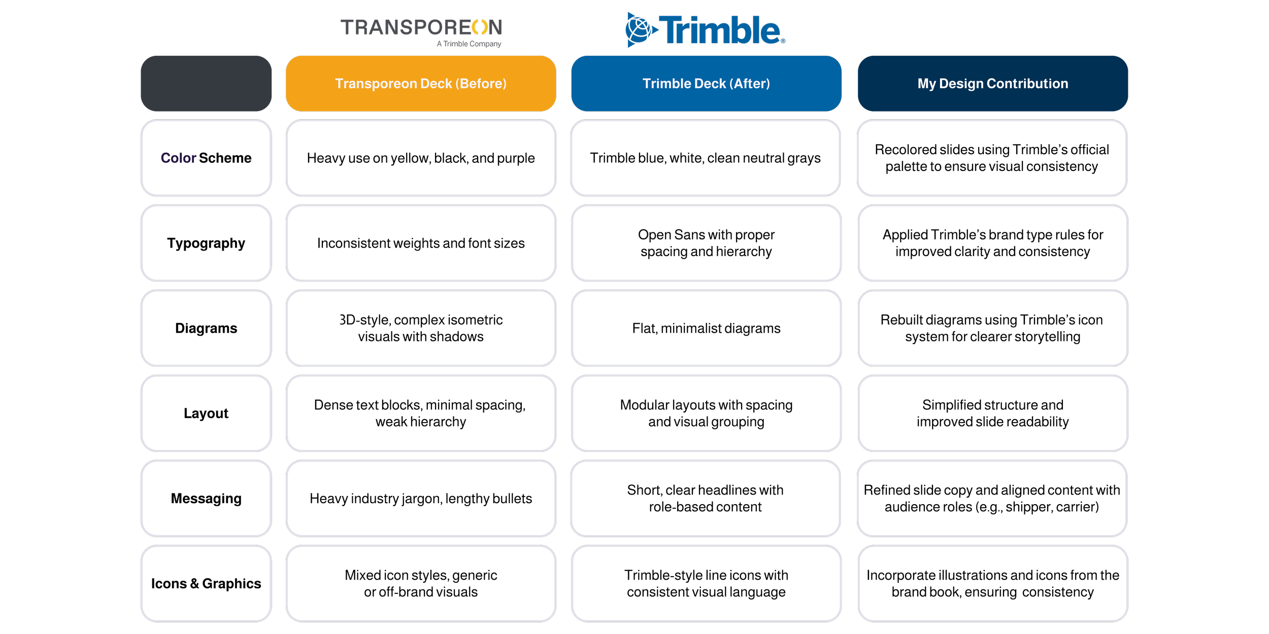

Before & After : Transporeon to Trimble
As part of Trimble’s acquisition of Transporeon, I was tasked with redesigning and rebranding their sales decks to align with Trimble’s presentation brand system. Below are three selected slides that showcase the transformation from Transporeon’s original design to Trimble’s updated visual direction.
Freight Marketplace System Flow
Before
After
Used a 3D-style, isometric diagram with gradients and shadows
Visually complex and harder to follow
Off-brand colors and iconography
Basic layout with no visual structure or focal point
Generic icon placed awkwardly, offering little clarity or visual engagement
No imagery or branding elements to enhance the content
Long text paragraphs with mixed icon styles and inconsistent spacing
No clear grouping or visual rhythm; difficult to scan quickly
Lacked modern styling and polish
Rebuilt the flow as a flat diagram for clarity and simplicity
Applied Trimble’s color palette, icon set, and abstract wave background pattern (top left corner)
Used clean arrows and step-by-step flow to improve visual navigation

Faster Counterparty Discovery
Before
After
Added human-focused imagery to build connection and professionalism
Used branded UI icons that visually represent core platform functions
Organized content with improved spacing, alignment, and Trimble typography for better readability

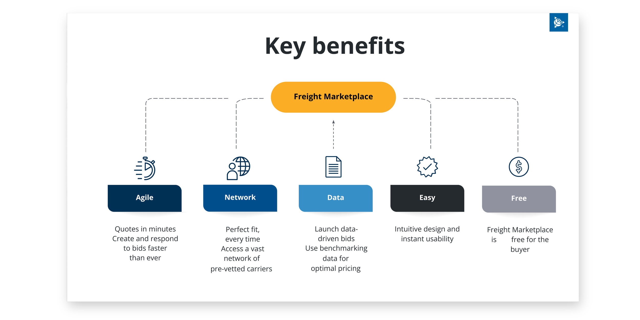
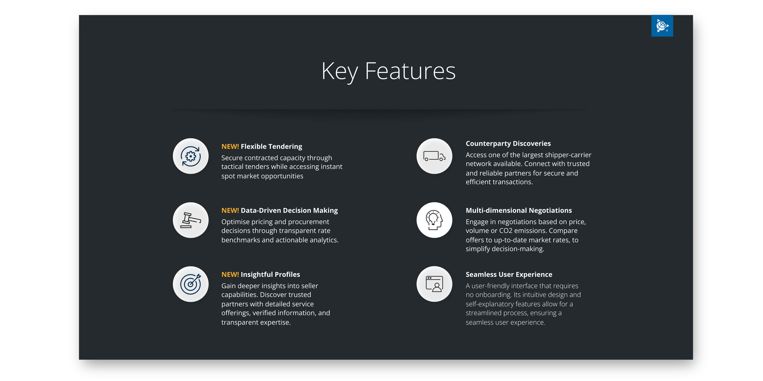
Key Feature Highlights
Before
After
Created a dark-theme layout to provide contrast and elevate visual impact
Aligned each feature with a simplified, circular icon and bold header
Grouped features for better readability and visual structure
Final Design
Before (Transporeon)
After (Trimble)
I redesigned the Freight Marketplace pitch deck by rebranding Transporeon’s original materials to match Trimble’s updated visual identity. Using Trimble’s presentation brand system, I applied official colors, icons, subtle shadows, abstract waves for the background and typography to create a cohesive, modern deck. Content was reorganized for clarity, visuals were simplified, and lifestyle imagery was added to make the presentation more human and engaging. The final result supports clearer, more effective communication for Trimble’s internal sales teams.
Discovered
Flattened, icon-led visuals help audiences better understand logistics solutions, especially when compared to over-styled diagrams.
Learned
Strong brand alignment and simplified layouts improve storytelling in enterprise contexts, making the pitch more effective.
Takeaway
Small design refinements (clean spacing, smart icons, and simplified diagrams) can dramatically improve clarity, confidence, and brand perception in sales presentations.