Trimble
Driving Efficiency: Freight Audit Solution Overview Sheet

Collateral
Project Detail
Trimble Freight Audit
Solution Overview Sheet
Role
Graphic Designer
Visual Layout Designer
Marketing Specialist
Duration
July 2025
(2 days)
Tools
InDesign
Brief
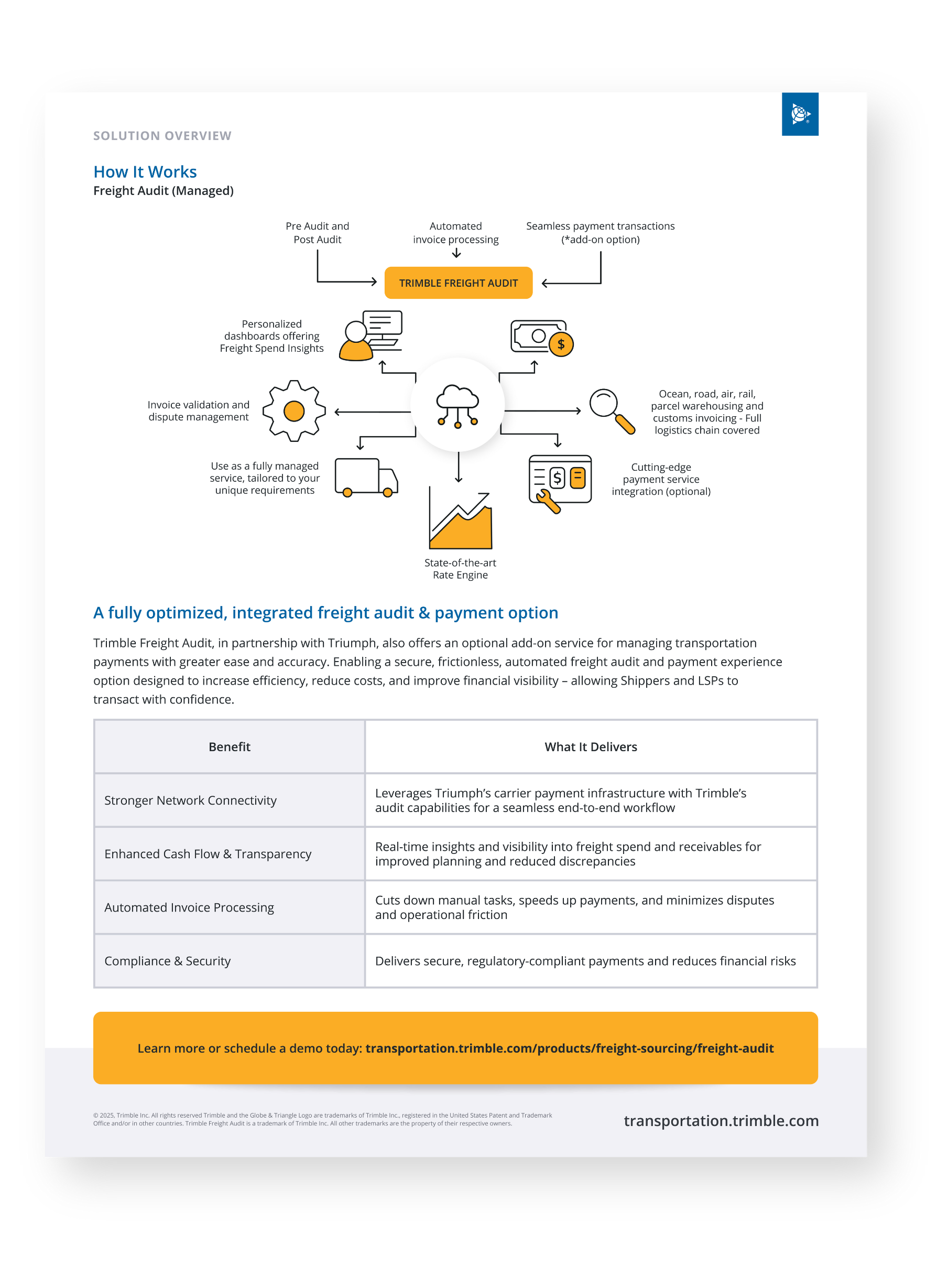
Transform a raw content brief and an outdated 3D-styled diagram into a polished, user-friendly one-sheet with a flat 2D aesthetic. The new design highlights automation, visibility, compliance, and the optional integrated payment feature while aligning with Trimble’s brand.
Overview
The project required taking technical content and an outdated Transporeon-based visual, then reworking them into a clean, branded layout. The challenge was to clearly communicate product features while ensuring visual alignment with Trimble’s identity.
Solution
I designed a cohesive layout and redesigned diagram in Trimble’s flat 2D style. I also added interactive hyperlinks to the PDF for seamless navigation, improving usability and user experience. Lastly, I highlighted freight audit benefits, optional payment integration, and process flow with clear, accessible design.
Research
Target Audience
Shippers and logistics service providers (LSPs)
Decision-makers in logistics, procurement, and finance who seek efficient, accurate, and transparent freight management solutions.

Problem

Old Design
Dense text & jargon
Content-heavy draft lacked readability and overwhelmed users.
No visual flow
Key features and benefits were buried within long paragraphs.
3D illustration style
Transporeon diagram clashed with Trimble’s flat 2D brand system.
Disconnected messaging
Payment integration was not clearly tied to the audit solution.
Limited usability
Original sheet lacked interactive elements such as links, reducing functionality for digital distribution.
User needs
Consistent, branded Trimble design
Clear, simplified visualization of freight audit and payment process
Interactive elements for easy access to product pages
User goals
Quickly grasp the value of Trimble Freight Audit
Understand integration of payment services
Access demo or product details seamlessly
User frustrations
Confusing old branding elements
Visual inconsistency with Trimble’s flat, professional style
No direct navigation options in the PDF

Rebrand old visuals to match
Trimble’s identity
Need & Solution
Simplify complex information into an
engaging solution overview sheet
Structure the content with
hierarchy and clear callouts
Goal
Enhance usability through clickable links
Embed interactive hyperlinks for
improved user experience
Deliver a branded, modern, and interactive overview sheet that strengthens Trimble’s credibility and engages decision-makers
Replace 3D Transporeon diagram with a
flat 2D Trimble-branded version
Design
Design System
Font
Tone of Voice
Modern
Accessible
Professional


Color
Solution Overview Sheet
InDesign
To ensure clarity, consistency, and brand alignment, I designed the solution overview sheet from the ground up in InDesign.

Process Highlights:
Built a Custom Template
Set up grids, margins, and typography styles in InDesign to create a reusable layout system for future solution sheets.
Applied Flat 2D Branding
Rebranded the original 3D Transporeon diagram into Trimble’s flat 2D aesthetic (“Trimbelized”) using simple shapes, icons, and a clean color palette.
Structured Content Layout
Organized copy into digestible left/right sections with bullet points, callouts, and a dedicated diagram space for quick scanning.
Added Customer Quotes
Integrated testimonial quotes to build credibility and connect the technical solution with real-world client perspectives.
Enhanced Usability
Embedded hyperlinks within the PDF so readers can instantly access Trimble product pages and demos, improving navigation and user experience.
Discovered
Balancing concise messaging with detailed technical value points was essential for maintaining engagement.
Learned
Rebranding 3D visuals into a flat 2D aesthetic created consistency, while visual hierarchy and embedded interactivity helped decision-makers quickly grasp complex logistics solutions.
Takeaway
Good design is not only visual. It enhances brand consistency, usability, and accessibility for end users.